Feeds:
Posts
Comments

Posts Tagged ‘illustration’

I’m all about bringing nature indoors. That’s why its been such fun this winter to sip tea and to work with images in the public domain, as well as my own photography, to update my redbubble shop. I selected several artists whose works moved me personally and sorted through merchandise I would actually use. First up … William Morris.

I’m a fan of Morris’s bright, bold prints but I liked these for their unfinished quality and the softness of the colors. Very soothing to me. See what you think when you visit the shop.

And you can learn more about Morris via this Wikipedia page.

Read Full Post »

CynthiaPattern

It was a rainy day which was okay because I think we need the rain. So I stayed inside dealing with necessary paperwork and wonderfully unnecessary research and in between I continued to play around with online tools like GIMP. I’m notorious for asking friends, especially when they’re grumpy, what brought you joy today? Several things brought me joy today, including dabbling in virtual paint to produce these patterns.  I hope you had a good day.

cynthiapinkpattern2

Read Full Post »

That is what I encourage you to do if you choose to view the poem, Refugee, written by Miki Byrne and beautifully illustrated by Podessto:

http://popshotpopshot.com/posts/20170215-refugee.html

Read Full Post »

Read Full Post »

James Weldon Johnson and Aaron Douglas

James Weldon Johnson (1871-1938) and Aaron Douglas (1899-1979)

Originally published in 1927, James Weldon Johnson’s book, God’s Trombones, is a slim volume composed of a prayer and seven poems: Listen, Lord–A Prayer, The Creation, The Prodigal Son, Go Down Death, Noah Built the Ark, The Crucifixion, Let My People Go, and The Judgement Day. The verses were inspired by his experiences attending black churches throughout the American south. The preachers’ oratory inspired Johnson to write these poems and, in the book’s preface, to reflect upon the nature of oration and folk traditions. His poems, I assume, inspired his artistic collaborators, Aaron Douglas and Charles B. Falls. The signature styles of two very different artists were brought together to complement Johnson’s words.

lettering by Charles Buckley Falls

Lettering by Charles Buckley Falls (1874-1960)

A publication was produced that is really quite distinctive with regard to words, images and overall concept. Johnson as scholar as well as poet produced a tome that captured in a unique way the power and importance of religion in the African American experience. He makes real even for those not having attended black churches how the preachers – God’s trombones – used word, rhyme and rhythm to give voice to the stories in the bible even when no bible was present.

Illustration

It would be easy to pick up this book, to skip the preface and go straight to the poems. But don’t. Johnson’s preface is critical, for his brief and cohesive insights into religion and the American experience, and for his guidance in how to truly appreciate what he was attempting to do with this book.

I claim no more for these poems than that I have written them after the manner of the primitive sermons. In the writing of them I have, naturally, felt the influence of the Spirituals. There is, of course, no way of recreating the atmosphere — the fervor of the congregation, the amens and hallelujahs, the undertone of singing which was often a soft accompaniment to parts of the sermon; nor the personality of the preacher — his physical magnetism, his gestures and gesticulations, his changes of tempo, his pauses for effect, and, more than all, his tones of voice. These poems would better be intoned than read; especially does this apply to “Listen, Lord,” “The Crucifixion,” and “The Judgment Day.” But the intoning practiced by the old-time preacher is a thing next to impossible to describe; it must be heard, and it is extremely difficult to imitate even when heard. …

“… The tempos of the preacher I have endeavored to indicate by the line arrangement of the poems, and a certain sort of pause that is marked by a quick intaking and an audible expulsion of the breath I have indicated by dashes. There is a decided syncopation of speech — the crowding in of many syllables or the lengthening out of a few to fill one metrical foot, the sensing of which must be left to the reader’s ear. The rhythmical stress of this syncopation is partly obtained by a marked silent fraction of a beat; frequently this silent fraction is filled in by a hand clap. …

The ensuing poems do read like song and the power of the words are echoed and strengthened by the complementary visusals.

Illustrations by Douglas for the poems, The Creation, The Prodigal Son, and Go Down Death.

Illustrations by Douglas for the poems, The Creation, The Prodigal Son, and Go Down Death.

Noah Built the Ark

Illustration and complementary chapter head for Noah Built the Ark

Illustration for The Crucifixion

Illustration for The Crucifixion

Illustration for Let My People Go

Illustration for Let My People Go


Both Johnson and Aaron Douglas are considered key figures of the Harlem Renaissance. Charles B. Falls was a noted illustrator and designer especially remembered for the posters he created during World War I and II as part of the Victory Books Campaign.

Over time the book has been reprinted numerous times including an edition by Penguin Classics, edited by Henry Louis Gates and with an introduction by Maya Angelou. As Johnson wrote in his preface the poems are really meant to be performed and over the years many individuals and institutions have done just that. Recordings can be found online.  You can also find the book fully digitized and viewable online thanks to the Documenting the American South project at University of North Carolina at Chapel Hill, my primary source for this post. I hope you have the opportunity to view the book in-hand or online: http://docsouth.unc.edu/southlit/johnson/johnson.html


Sources & Additional Readings

God’s Trombones (digitized) – http://docsouth.unc.edu/southlit/johnson/johnson.html

James Weldon Johnson – https://en.wikipedia.org/wiki/James_Weldon_Johnson

Aaron Douglas – https://en.wikipedia.org/wiki/Aaron_Douglas

Charles Buckles Falls – https://en.wikipedia.org/wiki/Charles_Buckles_Falls

The New Negro Renaissance – http://exhibitions.nypl.org/africanaage/essay-renaissance.html

More about the Victory Books Campaign – http://arcweb.sos.state.or.us/pages/exhibits/ww2/services/books.htm

Read Full Post »

St. Dominic’s life is on display in Stephen’s living room. Grand in its expression, it appears in a small painting on paper, only slightly larger than 2′ x 2′ unframed. It is in fact the colorful sketch for a much larger work — a mural on the wall of St. Dominic’s Priory in Washington, D.C.

Each section of the painting, and of the final mural, has meaning. The image is divided into seven parts, depicting seven scenes from Dominic’s life, from the center upper part where “God’s Hand puts halo around St. Dominic and drops into beggar’s bowl a star …” to the center lower part where “Two Angels lift the saintly pilgrim by his bleeding feet toward the stars in heaven.

The painting was in the possession of Ludwig Joutz (1910-1998), an architect with the D.C. based firm, Thomas H. Locraft and Associates, noted for what today is often described as sacred architecture. In 1960, his company designed a new priory for St. Dominic’s Church. Construction was completed in 1962.  On a lined office pad Joutz sketched the initial concept for the mural. That yellowing piece of paper remains with the painting, a painting that is signed and dated by artist Pierre Bourdelle (1901-1966).

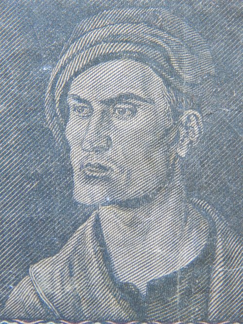
Loutz must have treasured Bourdelle’s work.  After he retired, he and his wife moved to Florida and with him he carried Bourdelle’s painting. Loutz, himself an artist, would sketch the interior of his home in Florida. In one drawing there on the wall is the same painting that Loutz’s son would eventually give to Stephen after his father’s death.

artwork by ludwig joutz

artwork by ludwig joutz

Ludwig’s son remembered his father meeting with Bourdelle as he worked on the mural but little else could he tell me and so my research began. Thankfully, there was quite a bit of information to be found online and in newspaper archives.

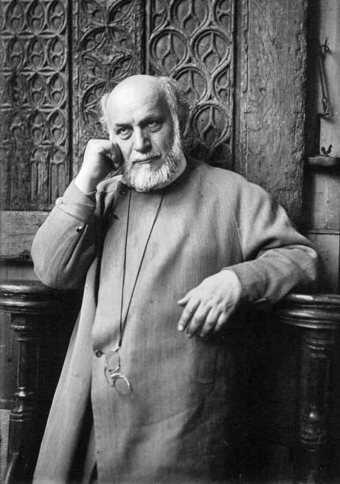
Born in Paris, France, Pierre Bourdelle was the son of famed sculptor Antoine Bourdelle.  He studied under Auguste Rodin in whose studio his father worked from 1893-1908. During his time as Rodin’s chief assistant, his father taught the likes of Henry Matisse and Alberto Giacometti. One biographer notes that with Rodin, a young Bourdelle visited Europe’s great Cathedrals.

rodin by edward steichen, 1911

rodin by edward steichen, 1911

Eventually Pierre would move to the United States and set up a studio in New York. In effect, he stepped out of his father’s shadow.

antoine bourdelle, 1925

antoine bourdelle, 1925

In a 1934 interview, he expressed: “In France, a man is judged by what his father did or by his family tree. In the United States a man is judged by himself, his personality, his own work. In France, they offered me mural jobs because my father was a well-known artist. They did not even look at my work.

pierre bourdelle, 1934

pierre bourdelle, 1934

A man of diverse interests and talents, he’d traveled the world studying the art of different cultures, observing the nature of different places.  Over time, based on some of the things he’d seen, he developed a new technique that set him apart as a muralist.

excerpt from 1934 article

Search online and you’ll find a wealth of information about his Art Deco paintings and sculptures from the 1930s and 1940s. His bold and vibrant work adorned the interiors of ocean liners, railway lines like the California Zephyr, and the walls of institutions like Union Terminal in Cincinnati.

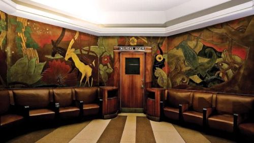
jungle mural by bourdelle for cincinnati terminal

He was a versatile artist capable of working with many media.  For Cincinnati’s Union Terminal, he not only created exotic jungle murals carved in linoleum, he also painted the ceilings of several rooms using an electric spray gun on canvas.

For the 1939-1940 New York World’s Fair, he created murals for Food Building North No. 2.  As described by a journalist covering the fair for Collier’s Magazine in 1939, There was Pierre Bourdelle, stripped to the waist in the hot sun and covered with red plaster dust. Gobs of wet plaster, a good blank wall, tools in his hands. That’s all Bourdelle, pupil of Rodin, asks to make him happy.”

His design motif for the fair was described as low bas-relief representing Bacchantes reveling at a wine-harvest festival, mythological animals, and scenes of beverage-making in various cultures.

sunshine and rain by bourdelle 1939

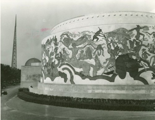
larger detail of vineyard mural on food building, 1939

Vineyard by Bourdelle 1939

While not everyone appreciated his style, e.g. so many sinuous forms wrapped around each other, few could deny the provocative and captivating nature of his work.

When World War II broke out, Bourdelle felt compelled to join the war effort.  He’d served in France during World War I. He’d been too young, only 15, but he’d lied about his age and was able to join an aviation unit.  When his plane went down, he suffered traumatic ear injuries.  A number of the biographies I found suggest that the horrors of that first war, the so-called Great War, influenced his art as no doubt did his participation in World War II. While unable to enlist because he was considered too old, he did serve in his own way, as a volunteer ambulance driver with the American Field Service at the North African and Italian fronts.

In 1945, upon his return to the U.S., Bourdelle would produce a book of images, simply titled, War. For the foreward, Stephen Galatti , the Director General of the AFS, would write, “Overseas Pierre Bourdelle saw suffering. He did his best to alleviate suffering, driving the wounded soldiers of many Allied armies. Helping staunch and bind their wounds in the field dressing stations. He knows the agony of war. He has no fear of showing war at its useless worst. He is not only a personally brave man who volunteered to go, and went, wherever the wounded were. He is an intellectually brave man, who makes no pretense at hiding the bare hideousness of warfare. … They are not pretty pictures. They show nothing but reality …”

Et Quare Tristis Incedo

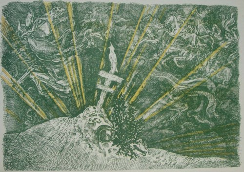
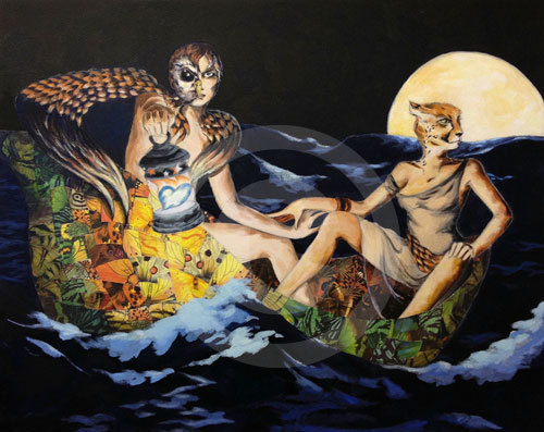
They may not be pretty but they are horribly beautiful.  And as I perused all 50+ images, viewable online here, I could not help but be fascinated by Bourdelle’s evolution as an artist …

Land Mine

… seeing these works done in the 1940s and then …

Calvalry

… being able to look at the drawing he did in the early 1960s for the St. Dominic mural.

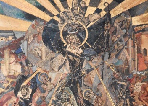
I suspect I will never see in-person the actual St. Dominic mural.  First of all, it is in a monastery chapel. Second of all, it has been covered in an attempt, I believe, to preserve it from the deterioration of time.

During the latter years of his life, Pierre Bourdelle continued to work as an artist and as a teacher.  He taught at C. W. Post, part of Long Island University, as an artist-in-residence. He died in 1966 while traveling with his family in Switzerland.


Sources and Additional Reading

Bourdelle Family History – http://www.mountharmonyfarm.com/GH-P-BourdelleItems.html

SS America Unique Story of a Great Ocean Liner/Bourdelle Page – http://www.ssamerica.bplaced.net/art2-en.html

Artwork for the California Zephyr – http://calzephyr.railfan.net/artists/bourdelle.html

Manuscripts and Archives Division, The New York Public Library. “Art – Murals – Food Buildings – The Vineyard (Pierre Bourdelle)” The New York Public Library Digital Collections. 1935 – 1945. http://digitalcollections.nypl.org/items/5e66b3e8-7352-d471-e040-e00a180654d7

Collier’s, Volume 103, p. 16

Bourdelle Art for Dallas Fair Park – http://frenchsculpture.org/dallas-fair-park-1

https://en.wikipedia.org/wiki/Cincinnati_Museum_Center_at_Union_Terminal

The Glass Storybook and the Great Menagerie The Art of Winold Reiss and Pierre Bourdelle – http://www.cincymuseum.org/union-terminal/art

History of Cincinnati Union Terminal – http://library.cincymuseum.org/75th-anniversary/main.swf

Bourdelle’s War – http://www.ourstory.info/library/4-ww2/Bourdelle/pbTC.html

Bourdelle Papers at Syracuse Libraries  – http://library.syr.edu/digital/guides/b/bourdelle_p.htm


Read Full Post »

illustration by zoe langosy

illustration by zoe langosy

Pencil has met paper. Lines have been drawn. Soon images will be cut and painstakingly applied to a sensuous form. An original concept has evolved with the core idea the same — figures clothed by nature. My photography as the “fabric” in the hands of fashion illustrator Zoe Langosy.  Here’s a sneak peek at her current work in progress, a rendering of a Valentino dress to be collaged with three of my photos.

creative swatch by zoe langosy

creative swatch by zoe langosy

In her own words: What has surprised me about the evolution of this work is that the initial drawing was classical in its rendering in part because Valentino is so classical, his fashion prim and romantic.

illustration by zoe langosy

illustration by zoe langosy

But after the initial drawing which echoed that romantic sentiment, I lost interest and began a new drawing, one more dynamic and sensual. The wonderful challenge for me is to use the Valentino dress in a different way, to take this beautiful classical garment by a master designer, and render it with a darker edge that’s more inline with my own artistic style.

photo courtesy of zoe langosy

The artist is at work, ladies and gentlemen. Stay tuned for future updates. New to this story of a unique collaboration?  Read more here: a new year and new collaborations and here fashion plus nature equals

http://www.zoe.langosy.net/

Read Full Post »

It must be a sign of the times that as I flipped through Edgar Allan Poe’s Tales of Mystery and Imagination as illustrated by Harry Clarke, I could not help but think what a great adult coloring book these illustrations would make. Perhaps not all of the illustrations … unless you’re into zombies and the Walking Dead. But these scenes from Poe’s short story Morella

and these from The Colloquy of Monos and Una called to me with their flower and nature imagery.  Harry Clarke (1889-1931) is perhaps more widely known for his stained glass work. Whether working with glass or with paper for his book illustrations, I wonder at the sources of his creative vision. I’m not always sure why I am inspired to do something but it sure is fun to take time to explore the possibilities. And to talk with other artists about their influences.

I can’t talk with Mr. Clarke but I am lucky enough to have access to a number of artists in my local community. Stay tuned for future updates about artists and their inspirations.

Read Full Post »

brazil: banknote showing freed slaves cooking

I am helping to research a bank note collection, mostly paper money from pre-World War Europe as well as other parts of the world. It is a fascinating project especially after the sometimes heated discussions here in the U.S. regarding the $20 bill and the plan to swap out the visage of Andrew Jackson for that of Harriet Tubman. Whichever $20 bill is held in hand in the future, embedded in that money, in the illustration, will be the story of that exchange. It’s the storytelling aspect that excites me about this bank note collection.  Gathered over many decades, the notes are like tiny time capsules with regard to artistic expression, economics, history and more. The nature of using money certainly continues to evolve (e.g. don’t carry cash at all, just swipe your phone!), but I expect paper money may be around for awhile.  Meanwhile, I’m looking forward to delving into the past and discovering the stories etched in these monies, a few of which are highlighted below.

    france: 1940s bank note, front image of Pyrenean shepherd

france: 1940s bank note, image of Pyrenean shepherd

germany

germany: notgeld was emergency money

british armed forces special voucher

u.s. military payment certificate

Read Full Post »

Just last night I spoke with a young friend. I’d sent her a greeting card depicting a cat, sleek and gilded and sparkling with jewels. You see, my young friend tends toward attire that also catches the light. She’d had the card framed and was trying to decide where to hang it on her wall. She already had framed a picture of an owl (I can’t remember if I’d sent her that). She asked, do you think the owl and the cat can be placed side by side? do you think they’d get along? I replied in surprise, my dear! have you never heard of the owl and the pussycat? She hadn’t. She asked, what’s the gist? I told her that I’d share the poem in full in a while but for now it was quite alright, indeed quite wonderful, for the owl and the pussycat to be close on her wall.

The Owl and the Pussycat was first published in 1871 by Edward Lear.  A poem once often told and memorized in schools. A nonsense poem that sparked the imagination. Prequels have been written, and sequels, and many a reinterpretation.  I’m not sure that the original is shared as often as it used to be. As National Poetry Month wraps up, read the poem for yourself on the Poetry Foundation website.  And here is unique interpretation of the story available as a print at LangosyArts.

The Owl and the Pussycat Print by Zoe Langosy

The Owl and the Pussycat Print by Zoe Langosy

Read Full Post »

Older Posts »