Feeds:
Posts
Comments

Posts Tagged ‘illustration’

fashion illustration by zoe langosy

In the Shadow of the Sun is a 2013 documentary directed and produced by Harry Freeland. I saw it for the first time a few weeks ago on PBS. As described on the film’s website, it was filmed over six years and tells the story of two albino people, one a successful older man and one a young boy, both living in Tanzania. The viewer learns of the myths that have come to be associated with these white people, the taunts endured, and in recent years the ritualized mutilations and murders. You also see people overcoming oppression, children striving to learn and to be seen as equal and indeed beautiful, and parents doing all they can to make their dreams reality.

While researching the film and trying to learn more about albinism, a condition that can affect people of all ethnicities, I came across recent articles about albino fashion models. There were a sequence of images of young people with an absence of melanin in their skin, ghostly, different and fiercely defiant in their attitude to be labeled as anything but beautiful. Fashion has been on my mind a great deal given the collaboration taking place with Zoe Langosy, so I sent her a random note asking, without really expecting an answer, how would an artist illustrate an albino. She sent a note back sharing she had done so as part of her honors thesis where she had produced a book, The Marriage of Fashion and Nature.

fashion illustration by zoe langosy

“It was a year long project. I decided to do a series of images depicting fashion made out of nature. At that stage, as a young student, my purpose was to create a perfect character and for this scene I just instinctively chose an albino and dressed him in a kimono made of pussy willows.”

With each image, including that of the albino is lyrical text.  While yet unpublished, following are a few glimpses of this beautiful handmade book.

Sources & Additional Reading

The Marriage of Fashion and Nature by Zoe Langosy (unpublished)

In the Shadow of the Sun (2012)

Zoe Langosy Website


Read Full Post »

details from life of st. paul's life, by henry holiday of london, 1878

details from st. paul’s life, by henry holiday of london, 1878

During my time visiting Trinity Church in the City of Boston, I have focused my camera on the details of the stained glass windows and the stories behind their creation. Within the church itself there are over 30 windows visible to the public and, less accessible to the public, there are additional windows in the parish house that I refer to as “hidden gems.”

detail from ephphatha by burlison and grylls

detail from ephphatha by burlison and grylls

Significant changes have occurred to the church over time, which you can learn about on the excellent guided tours. It’s the changes that took place in the parish house during the 1940s and 1950s that recently intrigued me. As the parish house was being reconfigured, three stained glass windows were removed.  My curiosity was sparked. What was the story of those “lost” windows? Here’s what I found on my search, not much that wasn’t already known but for me it was a wonderful journey.

An 1888 history of the church describes in detail The Harmon Window.  Designed by Frederick Crowninshield, the window was created in memory of Cordelia Harmon.  Harmon was “Almoner of Trinity Church for many years, and through her good deeds was well known by all the poor connected in any way with the Parish.”  The window depicted Charity composed of “a woman and two half-clothed children in the centre, and a figure with bowed head at the left. Behind is the figure of Christ, with his hand extended over them. Above is the text — Inasmuch As Ye Have Done It Unto One Of The Least Of These, My Brethren, Ye Have Done It Unto Me.” You can read more about Miss Harmon in this previous post Enduring Legacies.

1920s photo of Charity, courtesy of Trinity Archives

In a 1910 history of the church there is a description of The Tuckerman Window.  Designed by artist Francis Lathrop, most well known for his work with John La Farge on the murals of Trinity Church, the window depicted a woman surrounded by her four sons and instructing them from the bible.  According to the history, the woman and the boy at her right are the ones commemorated by the window.  They were Florence Tuckerman and her son Brooks Fenno Tuckerman. The design includes the words, Seek Ye Out The Book Of The Lord And Read. The window was given by Mr. and Mrs. John Brooks Fenno who also gave the window, The Storm on the Lake, located inside the church.

And finally there is The Suter Window. Designed by Charles E. Mills, it was executed by Edwin Ford and Frederick Brooks. It was a gift by Hales W. Suter in memory of his daughter, Gertrude Bingham Suter. “In the lower part of the window is the figure of a young girl, holding a sheaf of wheat.  On the ground before her, there lies a cross, while the path is strewn with roses. Her face is turned upward toward a vision – an angel who points out the New Jerusalem above.  The New Jerusalem is further represented in the smaller window above by the figures of two angels holding between them a crown.”

from Exhibition Catalog for the Boston Architectural Exhibition, 1891

The cartoon above I was able to find in the Catalog for the Boston Architectural Exhibition, 1891.  Such catalogs and similar art and architectural publications from the late 19th and early 20th centuries are increasingly being digitized and made available online. I love online research but it has been a pleasure interacting with archivists and stained glass experts too to learn as much as I did about these windows, the artists and their studios. While my search for now has come to an end, I hope you enjoy this brief glimpse of something beautiful that once was but is now no more except in stories. 😉

Read Full Post »

As artist Zoe Langosy and I move forward on a new collaboration, I follow her lead. And what a fabulous journey it is. I’m not the most stylish person on the block but even I know of Valentino, Alexander McQueen and a few other fashion makers out there. Zoe has introduced me to a part of the fashion world I knew little about, fashion illustration. It is amazing to me how an artist can translate the signature apparel of designers like Valentino into another medium that both promotes the original work of the designer and yet expresses the unique skills and vision of the illustrator. In this visual age there appears to be a renaissance taking place with regard to fashion illustration.  Many artists, many styles. Collage is Zoe’s medium of choice.

Creative Swatch by Zoe Langosy, pairing dress by Valentino with photographs by Cynthia Staples

I want her to write more about her creative process. How she can look at this dress by Valentino and then imagine collaging an illustration using my photos.  This is a creative swatch that she has put together to layout the pictures she intends to cut up. From top to bottom they are birch trees and grasses along the Mystic River, ice crystals on a window, and sunlight shining through an icicle.

Stay tuned for future updates!

Read Full Post »

… books by Bruno Munari on drawing trees and drawing the sun. Online descriptions suggest they were written for children but I think what is meant is children of all ages.  Unexpected finds as I walked through the library. Thank goodness I have a big backpack.

More information about Bruno Munari

Brainpickings on Munari: https://www.brainpickings.org/2012/11/22/bruno-munari-design-as-art/

drawing a tree:  http://www.artbook.com/8887942765.html

drawing the sun: http://www.artbook.com/8887942773.html

Wikipedia on Munari: https://en.wikipedia.org/wiki/Bruno_Munari

Read Full Post »

Kay Nielsen illustration for “The Story of a Mother” by Hans Christian Andersen

When I asked artist Zoe Langosy what she liked about this illustration by Kay Nielsen, she said, “I love the combination of nature and fashion that evokes a certain melancholy as well as beauty. A lone figure in a stark landscape, not unlike my own artwork as a fashion illustrator.  Decorative, yes, and through the decoration an emotion unveiled hinting at love, romance and most of all loss.” We weren’t sure at the time what story this work illustrated but even so “without any words embedded in the imagery is clearly a story.”  The viewing of this illustration has sparked a new collaboration — Zoe illustrating fashion collections using my nature images as part of her collage work.  Remember the Geishas? 😉

The Nielsen illustration was shared by friend, Donna Stenwall.  Donna, a former New England Regional Manager for Laura Ashley, remarked that she was drawn to the image because she has always loved winter scenes.  “This image looked so stormy, so desolate, and yet it was delicate and breathtakingly beautiful.  I was reminded of animation in the inherent motion on the page, this delicate female form, so dark in the white landscape with just a hint of caramel in her hair. Rather reminiscent of Zoe’s work.”

As we discussed collaboration, I shared with Zoe this image of evening light falling on marsh grasses. She didn’t react with her usual, “I can’t wait to cut this up!” Instead, she said, with raised eyebrow, “Can’t you imagine this as a Valentino wedding dress?” I can’t but she can and that’s the beauty of collaborating with this amazing artist. Stay tuned for updates on our progress!

LangosyArts

Read Full Post »

When do we see ourselves? How do we see ourselves? How is our sense of self shaped by the images of others?  This past year, I spent a lot of time researching U.S. history, mostly pre-Civil War into the early twentieth century.  One of the things that I re-discovered for myself was an evolution in the illustration and other visual representation of African Americans that reflected the sentiments of a rapidly evolving nation.  A nation that had loosely reknit after a Civil War, thirty-years later still in rancorous debate about the “Negro Problem”, and now having to deal with waves of mostly non-English speaking European immigrants making their way to a promised land. Culture clashes took place at every level of society. And those tensions were reflected in the arts and how “others” were represented.

I chanced upon an 1898 issue of the magazine, The Art Amateur: Devoted to Art in the Household, a popular type of magazine at the time.  The article that caught my attention, by E. Day McPherson, focused on Drawings of the Negro Character, an actual tutorial for how to capture the character of your artistic subject.  When reading the text I tried to keep in mind the context of the time. For example … “Character might be defined as the result of emotional habit, and certainly the lines expressive of character are those which show what emotions the person is most frequently subject to and in what degree he is accustomed to repress or hide them.  The negro is much more accustomed to give his emotions free play than white people, and they more than the yellow and the red races. To the Japanese we seem as “funny” as the negro seems to us …”

But my focus was not the words but the artist’s work.  Most publications from that time, outside of publications produced by African Americans, were already presenting stereotypical images of African Americans, if any images were being shown at all.  I was struck by Dee Beebe’s portraits of young African Americans, possibly in Galveston, Texas, in the casual clothing of their day.  I don’t know if she captured their character but she captured their beauty for me.

I couldn’t find out much about the artist. She was born in 1870 into a prominent family in Galveston, Texas. Her artistic skills were clear at an early age.  As one writer noted in 1896:

At the Art Academy of Cincinnati, she studied with Frank Duveneck.  In New York, she studied with William Merrit Chase and Kenyon Cox, and later with Theodore Wendel in Gloucester, MA.  Throughout her life she was a teacher while continuing to produce oil and watercolor paintings as well as etchings. The last reference to an exhibit that I could find was 1922.  She exhibited at the Ainslie Galleries in New York, seventy-five watercolors, “including bits of Holland and Switzerland, views of New England, the Arizona desert and around San Francisco and studies of flowers in localities as diversified as Prospect Park, Brooklyn, Los Angeles, Switzerland and Holland.” She died in 1946.

It would be intriguing to see more of the work of this artist. I found a few landscapes online.  The 1898 article says that at one period while back home in Texas she “devoted much time to the portrayal of negro types.” Perhaps those other images, if they still exist I might not like so much, but I am glad she created these images and that they were shared with the public in that popular magazine.

Sources

The Art Amateur: Devoted to Art in Household, Volume 39-40, 1898

Prominent Women of Texas (1896), p. 82

Magazine of Art, 1922


Read Full Post »

This too is a story about gifts.

watercolor by ludwig a. joutz

Ludwig Aloysius Joutz (1910 – 1998) was an architect noted for his work with religious and educational institutions primarily in the Washington, DC area.  I learned of this gentleman while researching Joseph Anthony Horne as part of my Interlude Series.

By the time Horne meets Joutz, Joutz had already earned his doctorate. His 1936 thesis is still referenced with regard to medieval church architecture.  In 1939/40 he was awarded a travel grant from the German Archaeological Institute but was perhaps unable to use it because of the outbreak of World War II.   He would be drafted into the German army and become a prisoner of war.

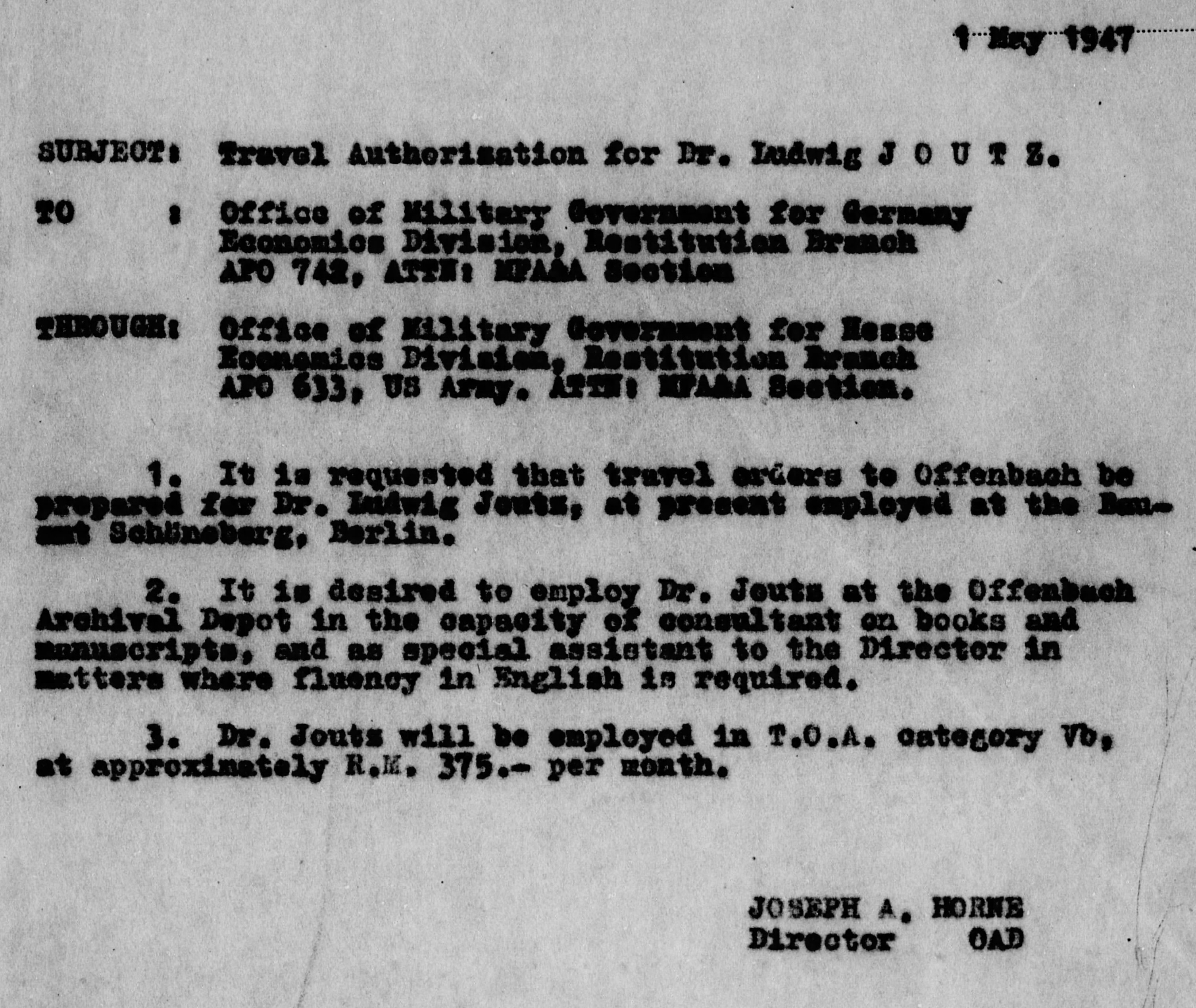
Exactly how he and Horne originally met is unclear.  It might have been as early as the Invasion of Italy where Joutz was captured but certainly by the end of the war they were fast friends.  The earliest document that I’ve been able to find so far is dated May 1947.  In that year, Horne was working with the Monuments, Fine Arts & Archives unit.

As the Monuments Men continued their efforts to find, catalog and restitute items looted by the Nazis and others during the war, Joutz would become a valuable resource.  German-born, he was fluent in English and several other languages and knowledgeable about the art and literary worlds. Horne, American-born and fluent in German thanks to his immigrant parents, was culturally sensitive and knowledgeable about the arts. They apparently worked well as a team.

LJConfirmation

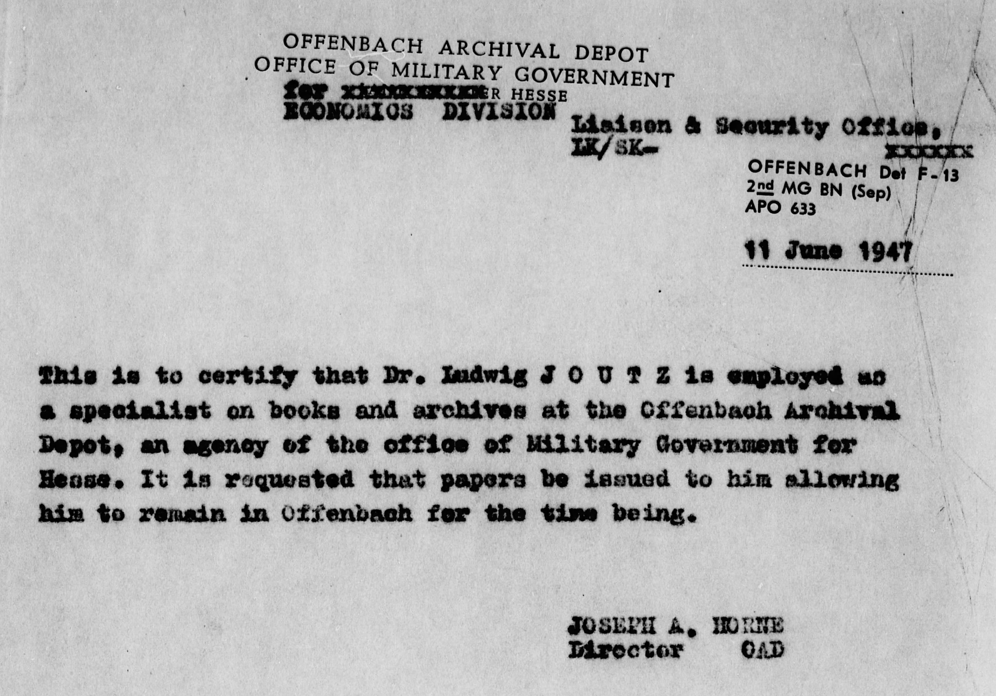
Between June 1, 1947 and March 1948, Joutz would serve as an operations specialist on books and archives at the Offenbach Archival Depot.  During that period, he and Horne, by then director of the Depot, would become great friends. Horne would aid Joutz in resettling in the U.S. where he would establish himself as architect. They would become godparents to each other’s children and remain friends until the end of their days.

familyceremony

joseph and elsie horne and ludwig and lucy joutz

Throughout out his personal and professional life, Joutz would travel around the world.   As part of those travels, whether for work or for pleasure, he would view his surroundings with an artist’s eye and try to capture what he saw.  Yes, with a camera like his friend Horne, but Joutz would also explore many different forms and techniques of art. He experimented with pen and ink, pastels, watercolor, woodblock prints, papercutting and more.  How do I know this? By a gift he painstakingly assembled for his son.

When visiting Joutz’s son, Frederick, a noted economist, I noticed a stack of suitcases tucked in a corner. Now these suitcases were the old-school, at least 1950’s if not earlier, kind of suitcases that are deep enough to curl up and go to sleep in and strong enough to, well, last a lifetime.  Frederick explained that they contained his father’s artwork. Now at first I thought he meant prints related to his father’s architectural practice, photos of completed projects, etc.  But that was not so.

artwork by ludwig joutz

artwork by ludwig joutz

artwork by ludwig joutz

Inside the suitcases was artwork spanning nearly five decades. Joutz had carefully organized his artwork, everything from sketches on the back of used envelopes to sweeping washes of color applied to delicate Japanese papers.  It was all layered in stacks in these deep suitcases.  The son remembered his father engaged in the process and how he culled items along the way. One can only imagine what the father may have considered not worth saving.

artwork by ludwig joutz

What I managed to see, the content of only two of the many suitcases, was breathtaking in its scope, in the diversity of imagery, and the range of techniques attempted. Each image suggested a story. On some of the pages were notes. What did they mean?

artwork by ludwig joutz

artwork by ludwig joutz

Some of the works were clearly copies of masterpieces, as done by any art student spending a day in an art gallery might do, but many images appeared to be of ordinary people.  Perhaps seen in European town squares or along desert routes when he traveled in Egypt?

artwork by ludwig joutz

artwork by ludwig joutz

artwork by ludwig joutz?

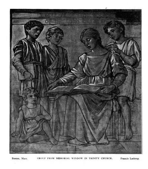
Then there are the images that are ecclesiastical in nature … were they the early concepts or cartoons for church murals? Did the murals still exist or had they become lost and all that remains are these vestiges?

Those are stories that others may choose to research and tell one day. I am grateful that his son allowed me to see just a fraction of what is contained in those suitcases.  And a salute to Mr. Joutz for preserving his own artwork as he helped to preserve the works of others throughout his career.

artwork by ludwig joutz


Sources and Additional Readings …

Fold3.com Holocaust Collection


Read Full Post »

watercolor study for purity, a stained glass window at trinity church in copley square

John La Farge and the Recovery of the Sacred is an exhibit at the McMullen Museum of Art at Boston College.  This free exhibit concludes December 13, 2015. I am most familiar with La Farge’s murals and stained glass windows at Trinity Church in Copley Square. Complex is a term often used to describe La Farge’s work, and I have a better understanding why after seeing this exhibit.

study for presentation of the virgin, a stained glass window at trinity church in copley square

It was a treat to see the range of his artistic talent expressed in pen and ink sketches, watercolors, oil paintings, wood block prints and of course in stained glass.

watercolor study by John La Farge

watercolor study by John La Farge

watercolor study for bishop hatto and the rats illustration

He may have been horrible at self-promotion, unlike his contemporary and supposedly one-time friend Louis Tiffany, but La Farge was certainly visionary when it came to manipulating light, colors and texture to capture particular moments, such as from his travels in Japan and the South Seas, and to tell stories both spiritual and secular.

tromple l’oeil curtain stained glass window by john la farge

Well worth a trip if you’re in the area. Further details can be found on the museum website: http://www.bc.edu/bc_org/avp/cas/artmuseum/visitor-information/index.html

Additional links

John La Farge and the Recovery of the Sacred Exhibit


Read Full Post »

Remember the hand of the budding artist? Well, mom is artist Zoe Langosy.  Recently, she mentioned how important this period of fashion weeks around the world had been in her artistic growth and I asked her to share more through her words and images …

When I was 14, the fashion world became a magic kingdom to me. Fashion took me on a journey through music, pop culture, the arts… I couldn’t get enough. Already developing into a figurative artist, my drawings became filled with long-legged, often tragic looking, beauties. All my characters were adorned in lavish attire made from a patchwork of fabrics and colors.  As this was before the internet, the way I kept up with my new found passion and muse was either on TV or through magazines.  My teenage bedroom began to overflow with Vogue’s from all over the world, Harpaar’s Bazaar, The Face, Sky… Nothing ever compared, though, to the September issue of American Vogue.

Each year seemed to compete with the year before… More pages, more looks, more exclusive inserts from designers. Each year, as summer drew to a close, my sister and I would check newsstands every day anticipating its arrival.  The first issue I purchased was in 1991. Linda Evangelista donned the cover, smoldering with red hair and tartan. I must have turned the pages of that issue a thousand times, and yet somehow kept it pristine like only a true collector could. Never letting any hands on it but my own.

photo by Zoe Langosy

24 years have passed, and I still feel a buzz when the September Vogue appears on the newsstand. It remains a guilty pleasure of mine, still inspiring my art … Of course, I have other inspirations these days as well.

These days, I’m okay if the cover gets scratched or my one-year old tears out a page. Now, it’s become so ingrained in my world it’s like buying a new set of pencils. Something I’m prepared to destroy and use purely as a visual playground that will set my imagination running.

Follow Zoe’s creative journey …

http://www.zoe.langosy.net/

Langosy Arts on Etsy

Read Full Post »

When I received Owls by Matt Sewell, I quickly flipped through the small hardback book, chuckling unexpectedly at some of the wide-eyed illustrations.  But I was in a rush, you see, and so I tossed the book on the coffee table intending to do a thorough inspection and review later in the day. Having been introduced to Blogging for Books by a friend, I wanted to do a good job.  Well, I can honestly say that it is a wonderful book to share with an inquisitive young reader.  My young friend whom I have mentioned often in this blog, now eight-years old, was visiting and she found the book.  I came upon her sitting quietly reading it on the couch. I watched as she sounded out Latin text and she also chuckled at the illustrations of owls each with a distinctive character.  When she saw me watching her, she waved me over to sit beside her and so we read the book together.  Each reading a page out loud about a different owl.

The author and illustrator is ornithologist Matt Sewell and I keep reading that he is described as the Banksy of the bird world.  Now, I just barely know who Banksy is (you can read more about him here https://en.wikipedia.org/wiki/Banksy ) but you don’t need to know Banksy to enjoy this book with or without a little reader by your side.

Yes, I received this book from Blogging for Books for this review.  A good deal but the best part was watching the joy the book brought to a young reader who is still learning about the world.  As my friend likes to say when she is happy with something, two thumbs up!

Learn more about the author here http://www.penguinrandomhouse.com/authors/152488/matt-sewell/.

Read Full Post »

« Newer Posts - Older Posts »